Click here to see the schedule of the sew-along.
First things first: What size Illusion quilt do you want to make?
The sample I made and shared is a 32-inch square wall hanging. For the sew-along, I’ll be making another quilt of the same size, because my husband will hang it in his office at work. If you’d rather curl up under the Illusion quilt, you can make it much bigger! Since Illusion is made up of half-square triangles (HST) and flying geese (FG), scaling it is quite straightforward.
The quilt size won’t change the number of the HST or FG units you will make; it will only change the sizes of those units. In the pattern, you have cutting measurements for two quilt sizes: 32 inches and 64 inches square. If you’re thinking about making a bigger quilt at 72, 80, 88, or 96 inches square, please refer to this previous post for the cutting measurements.
If you’re a beginner and worried about precision in cutting and piecing HST and FG units, I recommend going with a medium size like 64 inches.
Now the more fun question: What colorway will you use?
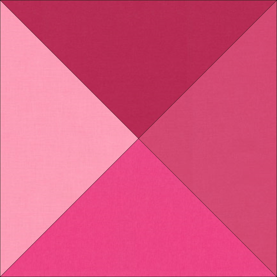
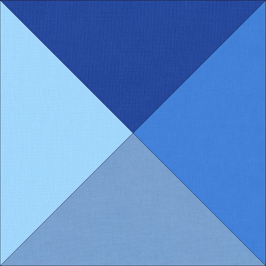
The pattern includes two colorways, one in pink and the other in blue. But you’re definitely not limited to these two choices! In fact, I’ll be making an orange one this time, since orange is my husband’s favorite color!
If you’re interested in the orange colorway, here are the names of the Kona© fabrics I will be using: Flame, Tangerine, Persimmon, and Cantaloupe.
So, how do you pick the colors for your quilt if you want to make it in another color?
What is most important for the Illusion quilt is the value of colors you choose. The value of a color refers to how light or dark it is. For Illusion, the value is important because it provides a gradient change in color to give the illusion of movement in the quilt that we all like!
The value of a color is not constant, it changes with the colors you use in your quilt. A fabric that looks very dark next to light fabrics may appear much lighter if you put it next to a very dark fabric. And sometimes it may be difficult to tell the value of colors. A commonly used trick is to convert the colors to black and white, so that you’re not distracted by the other qualities of the colors and can focus solely on their values.
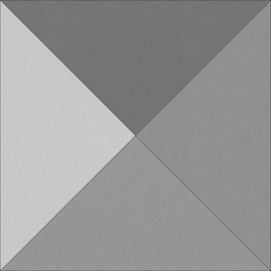
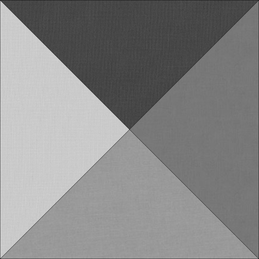
Here are the black and white versions of the two colorways I’ve used. The one on the left is the pink colorway, and the other one is the blue colorway. The colors get lighter as you move clockwise from the top color.
Note that the values change at different rates between these two colorways. In an ideal world, I’d prefer a value assortment like the one on the right for the Illusion quilt. That one has a very dark and a very light fabric and an even drop in value in between. However, we’re limited by the selection of fabrics we have at our disposal, so you might not get the same kind of distribution. But no worries, because we know that the one on the left worked just as well!
So, when you’re selecting your fabrics for the Illusion quilt, first choose a color family like reds, greens, yellows, etc. Then look at the fabric that is available. I’ve used Kona© but there are other manufacturers with large selections of solids. If you can, try to put several shades of the color you chose next to one another and see if the values are changing similar to the ones above. You can take a picture with your phone and then convert the picture to black and white to see the values of the colors.
If you’re buying fabric online, this will be trickier, since you can’t put them all next to one another. Also, what your screen shows may be different from the real colors. I’ve also noticed that different shops have slightly different pictures of the fabrics. I recommend comparing the fabric at a couple of different sites just to make sure that you get a good feel for the colors you’re choosing.
So now, let the fun begin! I look forward to seeing the colorways you choose to work with! Don’t forget to share your fabric selections here in the comments or on Instagram using #IllusionSAL!


